

Tuesday, 24 May 2016
Practical Resource for Nurses - Eureka
I was asked by PRN Magazine to create an illustration for their Eureka project, where each illustrator would choose a medical/scientific breakthrough and illustrate it. I chose Charles Darwin on the cusp of developing his seminal work- the theory of evolution. You can see it here: http://www.prnmagazine.com/blog-gr/2015/7/26/eureka-no-4-grace-russell

Tablet Magazine
My next commission was for the Jewish magazine, Tablet Magazine. The article was for a personal essay by Deborah A. Beverly on how converting to Judaism not only changed how she felt spiritually but also changed how she felt about her body. You can read the full article and see my illustration in context here: http://www.tabletmag.com/jewish-life-and-religion/191707/baring-myself-in-the-mikveh


Voyeur Virgin Australia's in-flight magazine and SOFFA
First of the next two commissions was for Voyeur, Virgin Australia's in-flight magazine. The piece was about investing in Australian Art and was a good shift from working on the dark, heavy subject of Therapy Today to something much lighter and colourful. I wanted to really amp up the playfulness to the illustrations too, something the art director had noted she'd liked about my work.


SOFFA was next, well I actually worked on these commission pretty much simultaneously and they both required quite a lot of work. SOFFA is a really beautiful, luxury magazine which has everything from recipes to diy, art, literature, so much, but the idea behind the commission was that I was given an extract from influential/prominent literature from the four corners of the globe. Because the client was based in Prague and then most of the text had been translated from its original language to Czech and then back to English, I had to read, re-read and then re-read again but in all I enjoyed the brief and my illustration was also chosen as the front cover.


First of many
Therapy Today was the first big commission after my last update and it's still one of my favourite commissions, the brief was just perfectly suited to my work. It's also really great when the articles are really lovely and weighty and interesting, so that you can draw out information that's not necessarily in the text and they engender some really strong images. So yeah, here's the illustrations. I also did a 'Behind the Pictures' interview which I will copy and paste at the end because the link seems to be broken.


Behind the pictures
Do you consider yourself to have a trademark style? If so, how would you describe it?
My style shifts and adapts to suit each project but as a general rule of thumb I try to focus on strong compositions full of atmosphere. Working with collage too my illustrations tend to have a lot of texture and depth, becoming a careful balance between the playful and controlled.
How would you describe the creative process you go through when working on your illustrations? Does it vary?
My starting point is always the literature. I’ll read and re-read the brief and other text (if its available), highlighting and deconstructing it as I go along and, simultaneously, create a series of marks that emit the tone of the text. This can act as a starting point from which to work out potential compositions as well as the general direction I’m going to take with the illustrations. I’ll also decide on colour theme and textures as this point. From there I’ll read the brief again and make sure that the visuals are communicating what they need to and are not just style over substance, if everything’s satisfactory then its just a matter of enjoying creating the final images.
How do you come up with your ideas and what inspires you?
The main source of ideas is the text that I’m given. I love reading between the lines (if it allows), coming from a different angle and I think its important that an image provokes you to look deeper and ask questions. I’ll sometimes take a random starting point such as an object or adjective and try to draw tangents to the brief but I’ll also draw out ideas from other articles, podcasts or books that I’m reading at the time. I enjoy focusing on strong compositions, the natural environment lends a lot of ideas for this but recently I’ve found architectural photography with modular, geometric forms can engender a lot of images and I also love the grainy texture of old photographs.
While working on your Therapy Today illustrations, did the ideas develop gradually or did you know from the outset the direction you were going in?
Reading the text certain points would start to stick in my mind, those that were still in my head after finishing reading were the leads I knew I wanted to pursue, so I guess the general direction and message to be communicated came pretty quickly to me. The visuals manifested more gradually, I sketched out a lot of potential compositions but wanted to allow more time to play around before deciding on the final ones.
Can you describe what inspired your Therapy Today illustrations?
The asylum seekers articles is very topical at the moment with all that is happening in Italy. I’d seen a lot of news reports and articles on the subject but as I read Jude Boyles description of the lonely, cold, isolated environment that her clients are subject to it threw up images that completely opposed the images of great swathes of people, joint and huddled, that is portrayed on the news. I thought it was really important that the illustrations communicated the solitary isolation that asylum seekers really experience.
Did illustrating these particular subjects throw up any challenges? If so, what were they?
In dealing with such sensitive issues, especially in the case of the domestic abuse article, I was very cautious of getting the balance between sensitivity and of creating a powerful, thought provoking image just right. It was important that the perpetrator of domestic abuse not to appear as a monster but his actions needed to be portrayed as monstrous and it was essential that the illustration separated the two.
Can you describe in a nutshell what you were trying to convey with each image?
The cover illustration focused on Jude Boyles’ words that asylum seekers are branded as criminals and so I had the shadow of the bars cutting across and assaulting the face of the man as to portray the negative behaviour and attitudes that are often felt towards asylum seekers. I also wanted to evoke an image of a stale, suffocating cell that Boyles’ client talks about with the hazy, purple that consumes him.
The inside illustration focuses on the sense of isolation and cold. I wanted the man to appear neglected, insignificant, blending into the shadows of his cold, blue cell devoid of natural light which Boyles’ client also speaks about.
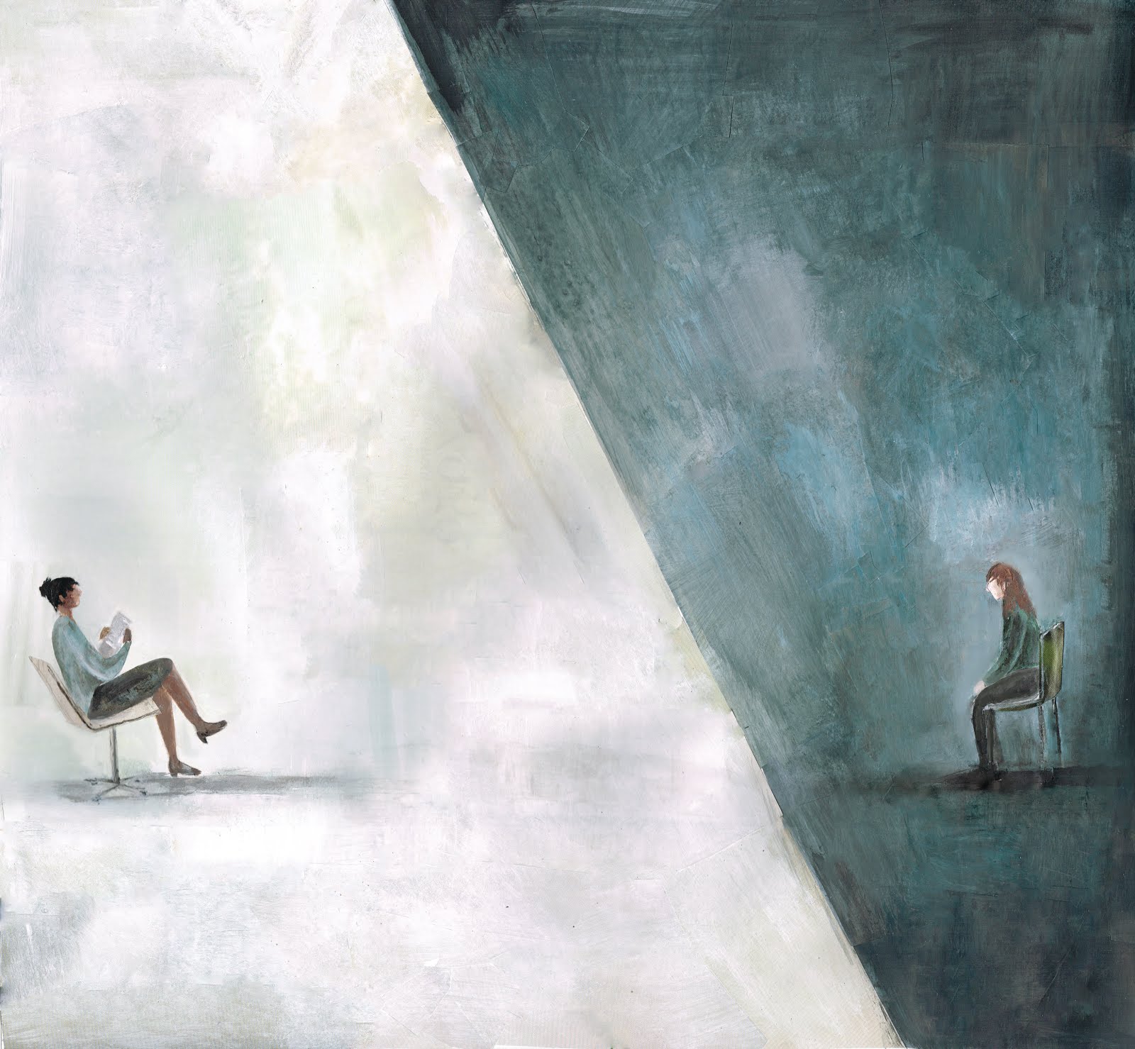
In the CBT article, Hadfield described her frustration over how CBT completely opposed all she knew therapy to be, devoid of any compassion or warmth. I set up a strong contrast between the therapist and client to emulate this very modular, un-comforting environment CBT creates where no connection exist between client and therapist.
For the article on domestic abuse, I focused on the the section which noted how most men in the trial identified being a good parent was important but didn’t recognise that their behaviour was preventing them from being this. I thought it was important the man appear shocked at his monstrous shadow towering over and consuming his children in darkness.
How do you feel about your finished work? What do you like most about your images and do you have a favourite image?
I’m really pleased with the end results. Its great to be able to illustrate the whole issue and focus on some really weighty topics. The inside illustration for Boyles’ Asylum Seekers article is probably my favourite, it was a fairly simple idea but I’m really happy with the composition and I think the use of negative space is quite impactful.
Apart from Therapy Today, where else might we see your work?
My website and blog show a continuous stream of updates and new work but most recently my work has been in The Loop and I H8 War. I’m also part of Spitalfields Silks which publishes illustrated stories onto silk, the first book is to be released on May 10th.
Brief biographical details (e.g. where you currently live and study or which projects you’ve worked on):
I’m a freelance Illustrator based in London. I graduated in 2013 with a First class BAHons degree in Illustration from the University of Westminster and won the Achievement Award in my first year. In 2014 I won the V&A Illustration Awards Student Category with my illustrations and book cover for Robert Macfarlane’s 'The Wild Places'. I’ve lived in and around London for most of my life but for the past two years I've been hiking and camping around North America, and whilst living in Canada for a few months I ran creative workshops for kids and teens. I’ve worked with clients that include The V&A, Kameleon, Spitalfields Silks/Sirens, The Loop, Reyker, Sony and P&G.


Behind the pictures
Do you consider yourself to have a trademark style? If so, how would you describe it?
My style shifts and adapts to suit each project but as a general rule of thumb I try to focus on strong compositions full of atmosphere. Working with collage too my illustrations tend to have a lot of texture and depth, becoming a careful balance between the playful and controlled.
How would you describe the creative process you go through when working on your illustrations? Does it vary?
My starting point is always the literature. I’ll read and re-read the brief and other text (if its available), highlighting and deconstructing it as I go along and, simultaneously, create a series of marks that emit the tone of the text. This can act as a starting point from which to work out potential compositions as well as the general direction I’m going to take with the illustrations. I’ll also decide on colour theme and textures as this point. From there I’ll read the brief again and make sure that the visuals are communicating what they need to and are not just style over substance, if everything’s satisfactory then its just a matter of enjoying creating the final images.
How do you come up with your ideas and what inspires you?
The main source of ideas is the text that I’m given. I love reading between the lines (if it allows), coming from a different angle and I think its important that an image provokes you to look deeper and ask questions. I’ll sometimes take a random starting point such as an object or adjective and try to draw tangents to the brief but I’ll also draw out ideas from other articles, podcasts or books that I’m reading at the time. I enjoy focusing on strong compositions, the natural environment lends a lot of ideas for this but recently I’ve found architectural photography with modular, geometric forms can engender a lot of images and I also love the grainy texture of old photographs.
While working on your Therapy Today illustrations, did the ideas develop gradually or did you know from the outset the direction you were going in?
Reading the text certain points would start to stick in my mind, those that were still in my head after finishing reading were the leads I knew I wanted to pursue, so I guess the general direction and message to be communicated came pretty quickly to me. The visuals manifested more gradually, I sketched out a lot of potential compositions but wanted to allow more time to play around before deciding on the final ones.
Can you describe what inspired your Therapy Today illustrations?
The asylum seekers articles is very topical at the moment with all that is happening in Italy. I’d seen a lot of news reports and articles on the subject but as I read Jude Boyles description of the lonely, cold, isolated environment that her clients are subject to it threw up images that completely opposed the images of great swathes of people, joint and huddled, that is portrayed on the news. I thought it was really important that the illustrations communicated the solitary isolation that asylum seekers really experience.
Did illustrating these particular subjects throw up any challenges? If so, what were they?
In dealing with such sensitive issues, especially in the case of the domestic abuse article, I was very cautious of getting the balance between sensitivity and of creating a powerful, thought provoking image just right. It was important that the perpetrator of domestic abuse not to appear as a monster but his actions needed to be portrayed as monstrous and it was essential that the illustration separated the two.
Can you describe in a nutshell what you were trying to convey with each image?
The cover illustration focused on Jude Boyles’ words that asylum seekers are branded as criminals and so I had the shadow of the bars cutting across and assaulting the face of the man as to portray the negative behaviour and attitudes that are often felt towards asylum seekers. I also wanted to evoke an image of a stale, suffocating cell that Boyles’ client talks about with the hazy, purple that consumes him.
The inside illustration focuses on the sense of isolation and cold. I wanted the man to appear neglected, insignificant, blending into the shadows of his cold, blue cell devoid of natural light which Boyles’ client also speaks about.
In the CBT article, Hadfield described her frustration over how CBT completely opposed all she knew therapy to be, devoid of any compassion or warmth. I set up a strong contrast between the therapist and client to emulate this very modular, un-comforting environment CBT creates where no connection exist between client and therapist.
For the article on domestic abuse, I focused on the the section which noted how most men in the trial identified being a good parent was important but didn’t recognise that their behaviour was preventing them from being this. I thought it was important the man appear shocked at his monstrous shadow towering over and consuming his children in darkness.
How do you feel about your finished work? What do you like most about your images and do you have a favourite image?
I’m really pleased with the end results. Its great to be able to illustrate the whole issue and focus on some really weighty topics. The inside illustration for Boyles’ Asylum Seekers article is probably my favourite, it was a fairly simple idea but I’m really happy with the composition and I think the use of negative space is quite impactful.
Apart from Therapy Today, where else might we see your work?
My website and blog show a continuous stream of updates and new work but most recently my work has been in The Loop and I H8 War. I’m also part of Spitalfields Silks which publishes illustrated stories onto silk, the first book is to be released on May 10th.
Brief biographical details (e.g. where you currently live and study or which projects you’ve worked on):
I’m a freelance Illustrator based in London. I graduated in 2013 with a First class BAHons degree in Illustration from the University of Westminster and won the Achievement Award in my first year. In 2014 I won the V&A Illustration Awards Student Category with my illustrations and book cover for Robert Macfarlane’s 'The Wild Places'. I’ve lived in and around London for most of my life but for the past two years I've been hiking and camping around North America, and whilst living in Canada for a few months I ran creative workshops for kids and teens. I’ve worked with clients that include The V&A, Kameleon, Spitalfields Silks/Sirens, The Loop, Reyker, Sony and P&G.
A serious case of neglect
I'm resurrecting my blog! Yes that's right, the rambles will be back with the occasional updates of my work, I'm also going to add in some advice/ things I've learned for good measure because I've had quite a few messages recently asking for advice. I have kept up my social media presence, twitter, instagram and tried tumblr actually in place of blogger but although I love the instant, ease of instagram there's still a sense of the personal missing so that's one of the main reasons that I have decided to come back. But anyway, yes, feel free to follow those accounts I will continue using instagram and twitter.
I honestly didnt know it was so long since I actually used blogger, there is an awful lot to updates to be done so I think I'll begin by following this post with updates of my work. To conclude this comeback post though in my personal life I am now a homeowner, my boyfriend and I have been working very hard to get the house in shape so maybe I'll do a studio tour at some point, and we got a puppy! He isn't old enough to leave his mum yet but I'll leave you with this photo of his face to melt your heart.

I honestly didnt know it was so long since I actually used blogger, there is an awful lot to updates to be done so I think I'll begin by following this post with updates of my work. To conclude this comeback post though in my personal life I am now a homeowner, my boyfriend and I have been working very hard to get the house in shape so maybe I'll do a studio tour at some point, and we got a puppy! He isn't old enough to leave his mum yet but I'll leave you with this photo of his face to melt your heart.

Subscribe to:
Posts (Atom)