So I'm working (yes I know again) on a super secret project, although this one won't be secret for too long. You'll actually only have to wait until mid October to find out a bit more, but it will be worth it.
I do feel like a little bit of a broken record on this blog, but I am super excited for this project! That's just the perks of doing something that you love, that you genuinely get really excited everyday (well not everyday) about working.
Anyway what I can tell you about this project is that it is very in keeping with me and my loves/likes; lots of traveling, lots of experiences, lots of adventure and my illustrations have just seemed to click and fall into place so perfectly. I had the roughs ready early and sent them over to the client yesterday afternoon ahead of schedule, which is pretty much a cardinal sin in the terms of freelance, but I was just so excited that I didn't want to wait until next week for feedback. Then I got one of the greatest pieces of feedback that made me even more excited and grateful to be part of this. So yeah, still not really a lot of information but an update and I'm trying to be consistent here guys.
Showing posts with label advice. Show all posts
Friday, 22 September 2017
Sunday, 10 September 2017
iPad Pro, Apple Pencil and Illustration
I decided to do a little write up about the iPad Pro and Apple pencil because its really changed my process of working. Before I start I want to stress that this isn't really a review of the iPad itself but more of my reasons for getting the iPad and Apple pencil and how its integrated with my illustration practice. So anybody looking for a reliable review on the pencil calibration or how it matches up to the Wacom or similar, Google is your friend :)
So for quite a while I felt as if I needed to make more of a switch to digital work, there's a number of reasons for this:
My work has always involved digital techniques; I clean up smears and paper joins, add various layers of more collage, draw elements using my wacom, but the iPad has taken it to a different level and made it that much easier. This doesn't mean that I'm dropping collage either, the main medium of my work is still collage, I'm just adding more digital elements and using the iPad to experiment.
I'd previously tried to work with an older iPad model and a generic compatible stylus but the results weren't great. The new Apple pencil is a dream to work with. Its so accurate and is pressure sensitive so its super easy to achieve natural looking lines and paint strokes. The dual sensors in the tip of the pencil and the surface of the iPad pick up not only on the pressure but also the angle at which you're holding the pencil so you can shade with the side of a pencil or create different thicknesses with the marker pen. The grip feels great and I like that its weighted, it feels solid but glides really easily and smoothly. I was worried about the friction, or lack of, between the pencil tip and iPad surface as this was something I really disliked when using a generic stylus but I was presently surprised. The matte tip of the pencil helps to give more of a resistance against the tablet surface. It's still not quite the sensation of a pencil over the grain of paper but I know there are a lot of matte screen protectors available at a relatively small price.
So far its made a great impact on my my work and my process of creating work so keep your eyes peeled for an influx of new work!
So for quite a while I felt as if I needed to make more of a switch to digital work, there's a number of reasons for this:
- The industry as a whole is progressively becoming more digital and I want to remain current
- It's cleaner. Working in collage is great but boy can it be really annoying when you're trying to get a flat colour and then you smear it with glue marks
- Mistakes, there's no backspace in real life guys
- Resolution, integrating digital elements means I can work on a much greater scale and ensure that my files are at the highest resolution. If anyone has ever scanned in a magazine print, then you'll see that even if its scanned to the highest quality, if the pixels aren't there then the image just becomes stripey and pixelated.
- Ease of use. Collage is so tricky to work with in different environments, going outside in the sunshine seems like a great idea to make work but then along comes a gust of wind and the idea suddenly become terrible. I also find it really hard to figure out colour palettes by sifting through piles and piles of papers. Some quick tests on the iPad are so much easier. And it means I can pick up my ipad and go where ever, whenever without having to plan or pack up all my stuff. I love working downstairs with my boyfriend and I can do this with my ipad without having to lumber all of my papers and collage and laptop and everything else (or have to clean up after myself!).
My work has always involved digital techniques; I clean up smears and paper joins, add various layers of more collage, draw elements using my wacom, but the iPad has taken it to a different level and made it that much easier. This doesn't mean that I'm dropping collage either, the main medium of my work is still collage, I'm just adding more digital elements and using the iPad to experiment.
I'd previously tried to work with an older iPad model and a generic compatible stylus but the results weren't great. The new Apple pencil is a dream to work with. Its so accurate and is pressure sensitive so its super easy to achieve natural looking lines and paint strokes. The dual sensors in the tip of the pencil and the surface of the iPad pick up not only on the pressure but also the angle at which you're holding the pencil so you can shade with the side of a pencil or create different thicknesses with the marker pen. The grip feels great and I like that its weighted, it feels solid but glides really easily and smoothly. I was worried about the friction, or lack of, between the pencil tip and iPad surface as this was something I really disliked when using a generic stylus but I was presently surprised. The matte tip of the pencil helps to give more of a resistance against the tablet surface. It's still not quite the sensation of a pencil over the grain of paper but I know there are a lot of matte screen protectors available at a relatively small price.
So far its made a great impact on my my work and my process of creating work so keep your eyes peeled for an influx of new work!
Tuesday, 29 August 2017
Rouleur issue 17.6
Latest set of illustrations for Rouleur, looking at the growing use of social media among road cyclists and the effects that it has had on the sport. I think I must have said it quite a lot before, but I really love working with these guys. The briefs are super fun and interesting and the images just come really easily.
Below are the final pieces. I'll also include a few of the roughs at the end. Before I've been a bit reluctant to share any rough work just because there may be the chance to recycle the idea or composition with another brief, but these are pretty specific so should be safe. My process of work took a bit of a dramatic shift from my usual approach and the iPad Pro and Apple Pencil were the only materials I used to create the roughs. As I mentioned before, I'm going to do a little write up on the iPad and my practice, but the benefit of using them meant that I was able to focus solely on the ideas and just pick up and create, rather than having to split my time between ideation and sifting through papers, for textures, colours, scanning, working up the roughs slightly etc.
Labels:
advice,
Art,
athlete,
collage,
freelance,
freelance illustrator,
illo,
Illustration,
illustration advice,
illustrator,
rouleur,
sport
Friday, 14 April 2017
Tablet Magazine
Keeping the updates coming, here's an illustration I did to accompany another really beautiful personal essay for Tablet Magazine. It discusses a woman's experience of holding her first dinner party since separating from her husband, helping her to understand what freedom really means.
I really love working with the people at Tablet magazine because they understand illustration, the idea of making reference to the parting of the red sea in the illustration came from the Art Director. I played on this a little further to create the waves out of curtains, towering around the dinner party, revealing the light shining through the window at the end of the table, portraying the safe passage of living a newly single life.
Labels:
advice,
Art,
blog,
divorce,
freelance,
freelance illustrator,
Illustration,
illustration advice,
Jewish,
personal essay,
published,
Seder,
separation
Wednesday, 12 April 2017
Rouleur Magazine
Here's a recent commission for Rouleur Magazine. It was three full page illustrations to accompany a humorous look at the diet of a cyclist, which is apparently a lot of pasta! I've worked with the Cycling magazine before and they are one of my favourite clients to work with, not only because I love sport and illustrating it but because their articles always bring out some really great and unusual imagery.
Here are the illustrations.
They'd used a square format previously before which had worked quite well so I decided to play with this a little and have elements spilling out of the square to create an illusion of perspective and also step into the viewers space, drawing them in and capturing their attention.
Labels:
advice,
Art,
athlete,
athlete diet,
blog,
collage,
cycle,
cycling,
cyclist,
diet,
freelance,
freelance illustrator,
illo,
Illustration,
illustrator,
published,
publishing,
rouleur,
sport,
update
Thursday, 16 February 2017
Update
2017 has gotten off to a flying start already with lots of work commissioned, completed and waiting for publication, so lots of new updates on my website and here to follow. For now, I finished off the last post with a teaser for something I'd been working on for a fairly long time on and off. If you follow me on social media you would have already seen that this was a little sneak peek of my first children's book! Dedicated to my niece, 'Want to Play?' follows Bear on his journey to find someone to play with. Here's a few spreads:
I focused on some really rich landscapes, full of texture and depth, to become the home of Bear, a little red abstract character made from simplified shapes and flat colours. This created a careful interplay between figurative and abstract to portray Bear's playfulness and energy.
I'm really happy with how the book turned out, landscapes are something I create most in my personal work because I think there can be something quite powerful about them. You can infer so much from a place, emotions, atmosphere, tone, all without showing a smile or frown.
I'd love to create another book and have some ideas floating around so watch this space!
If you would like to purchase my book you can do here: http://www.blurb.co.uk/b/7716267-want-to-play?t=1485257850887
I focused on some really rich landscapes, full of texture and depth, to become the home of Bear, a little red abstract character made from simplified shapes and flat colours. This created a careful interplay between figurative and abstract to portray Bear's playfulness and energy.
I'm really happy with how the book turned out, landscapes are something I create most in my personal work because I think there can be something quite powerful about them. You can infer so much from a place, emotions, atmosphere, tone, all without showing a smile or frown.
I'd love to create another book and have some ideas floating around so watch this space!
If you would like to purchase my book you can do here: http://www.blurb.co.uk/b/7716267-want-to-play?t=1485257850887
Labels:
2017,
advice,
bear,
blog,
blogger,
book,
children's book,
collage,
freelance,
freelance illustrator,
Illustration,
illustration advice,
landscape,
published,
publishing,
update
Location:
London, UK
Saturday, 17 December 2016
It's begining to look a lot like...
Me again. Ok so rather than go through more work, I am going to admit defeat and just pick up with the present day. I've been super busy working on a few projects and one huge project that has literally taken forever but I really hope will be worth it. All to be revealed just after Christmas. Here's a little teaser though.
With the end of the year fast approaching I thought I'd sum up some highs and lows from the last 12 months. The most significant thing to have happened (although not illustration related) is that my boyfriend and I have bought a house! Moving has been a big change and although definitely a real positive in 2016, it hasn't been without its stresses. Another great thing to happen this year is that I am an aunt and have the cutest niece in the world.
In terms of illustration work, it's really hard to select one project, I've worked with some really great people this year. I think working on the Rouleur illustrations were some of my favourites because it was such a shift from the darker work I'd been doing in 2015. They were also really, really great clients and Lizzie herself requested a print!
I also have to mention Therapy Today's July issue, in all honesty this was one of the hardest commissions I've worked on but ultimately I ended up with some work that I'm really proud of. They too are a really great clients to work with and they give really great art direction.
I worked on some other really great things this year, a few of which I still can't talk about due to client confidentiality but I don't want to overload this post, although drawing Trump on an Elephant for In-Mind Magazine was a personal highlight.
With the good there must always come the bad. Not being paid is never a good thing and something really frustrating to deal with when you've worked your butt off and still are busy trying to finish other commissions, but thankfully that issue is resolved and I'm not going to dwell or name and shame.
So that's all for this post. Let's not end on a bad note though so here's how big Rogue has got.
With the end of the year fast approaching I thought I'd sum up some highs and lows from the last 12 months. The most significant thing to have happened (although not illustration related) is that my boyfriend and I have bought a house! Moving has been a big change and although definitely a real positive in 2016, it hasn't been without its stresses. Another great thing to happen this year is that I am an aunt and have the cutest niece in the world.
In terms of illustration work, it's really hard to select one project, I've worked with some really great people this year. I think working on the Rouleur illustrations were some of my favourites because it was such a shift from the darker work I'd been doing in 2015. They were also really, really great clients and Lizzie herself requested a print!
I also have to mention Therapy Today's July issue, in all honesty this was one of the hardest commissions I've worked on but ultimately I ended up with some work that I'm really proud of. They too are a really great clients to work with and they give really great art direction.
I worked on some other really great things this year, a few of which I still can't talk about due to client confidentiality but I don't want to overload this post, although drawing Trump on an Elephant for In-Mind Magazine was a personal highlight.
With the good there must always come the bad. Not being paid is never a good thing and something really frustrating to deal with when you've worked your butt off and still are busy trying to finish other commissions, but thankfully that issue is resolved and I'm not going to dwell or name and shame.
So that's all for this post. Let's not end on a bad note though so here's how big Rogue has got.
Tuesday, 5 July 2016
Freedom from Torture
Back last year I was approached by the Charity Freedom from Torture and asked to create a piece to be auctioned off at their 30th Anniversary event.
Labels:
advice,
Art,
art auction,
auction,
blog,
charity,
collage,
freedom from torture,
freelance,
illo,
Illustration,
illustrator,
London,
print,
therapy,
therapy today,
update
Tuesday, 24 May 2016
Practical Resource for Nurses - Eureka
I was asked by PRN Magazine to create an illustration for their Eureka project, where each illustrator would choose a medical/scientific breakthrough and illustrate it. I chose Charles Darwin on the cusp of developing his seminal work- the theory of evolution. You can see it here: http://www.prnmagazine.com/blog-gr/2015/7/26/eureka-no-4-grace-russell
Labels:
advice,
Art,
blog,
collage,
freelance,
illo,
Illustration,
illustrator,
London,
update
Tablet Magazine
My next commission was for the Jewish magazine, Tablet Magazine. The article was for a personal essay by Deborah A. Beverly on how converting to Judaism not only changed how she felt spiritually but also changed how she felt about her body. You can read the full article and see my illustration in context here: http://www.tabletmag.com/jewish-life-and-religion/191707/baring-myself-in-the-mikveh
Labels:
advice,
Art,
blog,
collage,
freelance,
illo,
Illustration,
illustrator,
London,
update
Voyeur Virgin Australia's in-flight magazine and SOFFA
First of the next two commissions was for Voyeur, Virgin Australia's in-flight magazine. The piece was about investing in Australian Art and was a good shift from working on the dark, heavy subject of Therapy Today to something much lighter and colourful. I wanted to really amp up the playfulness to the illustrations too, something the art director had noted she'd liked about my work.
SOFFA was next, well I actually worked on these commission pretty much simultaneously and they both required quite a lot of work. SOFFA is a really beautiful, luxury magazine which has everything from recipes to diy, art, literature, so much, but the idea behind the commission was that I was given an extract from influential/prominent literature from the four corners of the globe. Because the client was based in Prague and then most of the text had been translated from its original language to Czech and then back to English, I had to read, re-read and then re-read again but in all I enjoyed the brief and my illustration was also chosen as the front cover.
Labels:
advice,
Art,
blog,
collage,
freelance,
illo,
Illustration,
illustrator,
London,
update
First of many
Therapy Today was the first big commission after my last update and it's still one of my favourite commissions, the brief was just perfectly suited to my work. It's also really great when the articles are really lovely and weighty and interesting, so that you can draw out information that's not necessarily in the text and they engender some really strong images. So yeah, here's the illustrations. I also did a 'Behind the Pictures' interview which I will copy and paste at the end because the link seems to be broken.
Behind the pictures
Do you consider yourself to have a trademark style? If so, how would you describe it?
My style shifts and adapts to suit each project but as a general rule of thumb I try to focus on strong compositions full of atmosphere. Working with collage too my illustrations tend to have a lot of texture and depth, becoming a careful balance between the playful and controlled.
How would you describe the creative process you go through when working on your illustrations? Does it vary?
My starting point is always the literature. I’ll read and re-read the brief and other text (if its available), highlighting and deconstructing it as I go along and, simultaneously, create a series of marks that emit the tone of the text. This can act as a starting point from which to work out potential compositions as well as the general direction I’m going to take with the illustrations. I’ll also decide on colour theme and textures as this point. From there I’ll read the brief again and make sure that the visuals are communicating what they need to and are not just style over substance, if everything’s satisfactory then its just a matter of enjoying creating the final images.
How do you come up with your ideas and what inspires you?
The main source of ideas is the text that I’m given. I love reading between the lines (if it allows), coming from a different angle and I think its important that an image provokes you to look deeper and ask questions. I’ll sometimes take a random starting point such as an object or adjective and try to draw tangents to the brief but I’ll also draw out ideas from other articles, podcasts or books that I’m reading at the time. I enjoy focusing on strong compositions, the natural environment lends a lot of ideas for this but recently I’ve found architectural photography with modular, geometric forms can engender a lot of images and I also love the grainy texture of old photographs.
While working on your Therapy Today illustrations, did the ideas develop gradually or did you know from the outset the direction you were going in?
Reading the text certain points would start to stick in my mind, those that were still in my head after finishing reading were the leads I knew I wanted to pursue, so I guess the general direction and message to be communicated came pretty quickly to me. The visuals manifested more gradually, I sketched out a lot of potential compositions but wanted to allow more time to play around before deciding on the final ones.
Can you describe what inspired your Therapy Today illustrations?
The asylum seekers articles is very topical at the moment with all that is happening in Italy. I’d seen a lot of news reports and articles on the subject but as I read Jude Boyles description of the lonely, cold, isolated environment that her clients are subject to it threw up images that completely opposed the images of great swathes of people, joint and huddled, that is portrayed on the news. I thought it was really important that the illustrations communicated the solitary isolation that asylum seekers really experience.
Did illustrating these particular subjects throw up any challenges? If so, what were they?
In dealing with such sensitive issues, especially in the case of the domestic abuse article, I was very cautious of getting the balance between sensitivity and of creating a powerful, thought provoking image just right. It was important that the perpetrator of domestic abuse not to appear as a monster but his actions needed to be portrayed as monstrous and it was essential that the illustration separated the two.
Can you describe in a nutshell what you were trying to convey with each image?
The cover illustration focused on Jude Boyles’ words that asylum seekers are branded as criminals and so I had the shadow of the bars cutting across and assaulting the face of the man as to portray the negative behaviour and attitudes that are often felt towards asylum seekers. I also wanted to evoke an image of a stale, suffocating cell that Boyles’ client talks about with the hazy, purple that consumes him.
The inside illustration focuses on the sense of isolation and cold. I wanted the man to appear neglected, insignificant, blending into the shadows of his cold, blue cell devoid of natural light which Boyles’ client also speaks about.
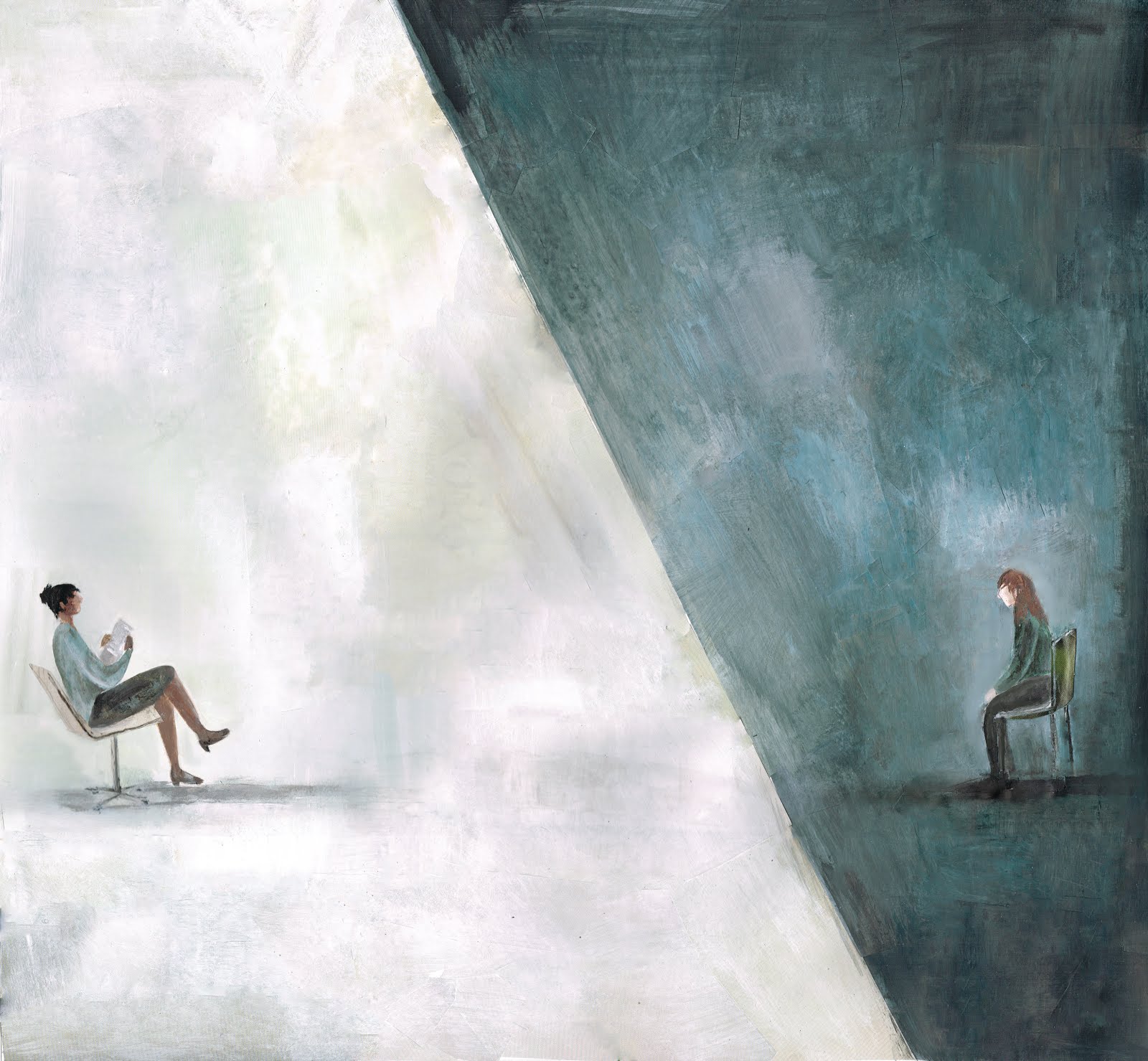
In the CBT article, Hadfield described her frustration over how CBT completely opposed all she knew therapy to be, devoid of any compassion or warmth. I set up a strong contrast between the therapist and client to emulate this very modular, un-comforting environment CBT creates where no connection exist between client and therapist.
For the article on domestic abuse, I focused on the the section which noted how most men in the trial identified being a good parent was important but didn’t recognise that their behaviour was preventing them from being this. I thought it was important the man appear shocked at his monstrous shadow towering over and consuming his children in darkness.
How do you feel about your finished work? What do you like most about your images and do you have a favourite image?
I’m really pleased with the end results. Its great to be able to illustrate the whole issue and focus on some really weighty topics. The inside illustration for Boyles’ Asylum Seekers article is probably my favourite, it was a fairly simple idea but I’m really happy with the composition and I think the use of negative space is quite impactful.
Apart from Therapy Today, where else might we see your work?
My website and blog show a continuous stream of updates and new work but most recently my work has been in The Loop and I H8 War. I’m also part of Spitalfields Silks which publishes illustrated stories onto silk, the first book is to be released on May 10th.
Brief biographical details (e.g. where you currently live and study or which projects you’ve worked on):
I’m a freelance Illustrator based in London. I graduated in 2013 with a First class BAHons degree in Illustration from the University of Westminster and won the Achievement Award in my first year. In 2014 I won the V&A Illustration Awards Student Category with my illustrations and book cover for Robert Macfarlane’s 'The Wild Places'. I’ve lived in and around London for most of my life but for the past two years I've been hiking and camping around North America, and whilst living in Canada for a few months I ran creative workshops for kids and teens. I’ve worked with clients that include The V&A, Kameleon, Spitalfields Silks/Sirens, The Loop, Reyker, Sony and P&G.
Behind the pictures
Do you consider yourself to have a trademark style? If so, how would you describe it?
My style shifts and adapts to suit each project but as a general rule of thumb I try to focus on strong compositions full of atmosphere. Working with collage too my illustrations tend to have a lot of texture and depth, becoming a careful balance between the playful and controlled.
How would you describe the creative process you go through when working on your illustrations? Does it vary?
My starting point is always the literature. I’ll read and re-read the brief and other text (if its available), highlighting and deconstructing it as I go along and, simultaneously, create a series of marks that emit the tone of the text. This can act as a starting point from which to work out potential compositions as well as the general direction I’m going to take with the illustrations. I’ll also decide on colour theme and textures as this point. From there I’ll read the brief again and make sure that the visuals are communicating what they need to and are not just style over substance, if everything’s satisfactory then its just a matter of enjoying creating the final images.
How do you come up with your ideas and what inspires you?
The main source of ideas is the text that I’m given. I love reading between the lines (if it allows), coming from a different angle and I think its important that an image provokes you to look deeper and ask questions. I’ll sometimes take a random starting point such as an object or adjective and try to draw tangents to the brief but I’ll also draw out ideas from other articles, podcasts or books that I’m reading at the time. I enjoy focusing on strong compositions, the natural environment lends a lot of ideas for this but recently I’ve found architectural photography with modular, geometric forms can engender a lot of images and I also love the grainy texture of old photographs.
While working on your Therapy Today illustrations, did the ideas develop gradually or did you know from the outset the direction you were going in?
Reading the text certain points would start to stick in my mind, those that were still in my head after finishing reading were the leads I knew I wanted to pursue, so I guess the general direction and message to be communicated came pretty quickly to me. The visuals manifested more gradually, I sketched out a lot of potential compositions but wanted to allow more time to play around before deciding on the final ones.
Can you describe what inspired your Therapy Today illustrations?
The asylum seekers articles is very topical at the moment with all that is happening in Italy. I’d seen a lot of news reports and articles on the subject but as I read Jude Boyles description of the lonely, cold, isolated environment that her clients are subject to it threw up images that completely opposed the images of great swathes of people, joint and huddled, that is portrayed on the news. I thought it was really important that the illustrations communicated the solitary isolation that asylum seekers really experience.
Did illustrating these particular subjects throw up any challenges? If so, what were they?
In dealing with such sensitive issues, especially in the case of the domestic abuse article, I was very cautious of getting the balance between sensitivity and of creating a powerful, thought provoking image just right. It was important that the perpetrator of domestic abuse not to appear as a monster but his actions needed to be portrayed as monstrous and it was essential that the illustration separated the two.
Can you describe in a nutshell what you were trying to convey with each image?
The cover illustration focused on Jude Boyles’ words that asylum seekers are branded as criminals and so I had the shadow of the bars cutting across and assaulting the face of the man as to portray the negative behaviour and attitudes that are often felt towards asylum seekers. I also wanted to evoke an image of a stale, suffocating cell that Boyles’ client talks about with the hazy, purple that consumes him.
The inside illustration focuses on the sense of isolation and cold. I wanted the man to appear neglected, insignificant, blending into the shadows of his cold, blue cell devoid of natural light which Boyles’ client also speaks about.
In the CBT article, Hadfield described her frustration over how CBT completely opposed all she knew therapy to be, devoid of any compassion or warmth. I set up a strong contrast between the therapist and client to emulate this very modular, un-comforting environment CBT creates where no connection exist between client and therapist.
For the article on domestic abuse, I focused on the the section which noted how most men in the trial identified being a good parent was important but didn’t recognise that their behaviour was preventing them from being this. I thought it was important the man appear shocked at his monstrous shadow towering over and consuming his children in darkness.
How do you feel about your finished work? What do you like most about your images and do you have a favourite image?
I’m really pleased with the end results. Its great to be able to illustrate the whole issue and focus on some really weighty topics. The inside illustration for Boyles’ Asylum Seekers article is probably my favourite, it was a fairly simple idea but I’m really happy with the composition and I think the use of negative space is quite impactful.
Apart from Therapy Today, where else might we see your work?
My website and blog show a continuous stream of updates and new work but most recently my work has been in The Loop and I H8 War. I’m also part of Spitalfields Silks which publishes illustrated stories onto silk, the first book is to be released on May 10th.
Brief biographical details (e.g. where you currently live and study or which projects you’ve worked on):
I’m a freelance Illustrator based in London. I graduated in 2013 with a First class BAHons degree in Illustration from the University of Westminster and won the Achievement Award in my first year. In 2014 I won the V&A Illustration Awards Student Category with my illustrations and book cover for Robert Macfarlane’s 'The Wild Places'. I’ve lived in and around London for most of my life but for the past two years I've been hiking and camping around North America, and whilst living in Canada for a few months I ran creative workshops for kids and teens. I’ve worked with clients that include The V&A, Kameleon, Spitalfields Silks/Sirens, The Loop, Reyker, Sony and P&G.
Labels:
advice,
Art,
blog,
collage,
freelance,
illo,
Illustration,
illustrator,
London,
update
Subscribe to:
Posts (Atom)